Analyzing the Mobile Home Park Industry in Florida: A Data-Driven Exploration
Introduction
As a data analyst, my recent project involved gathering and analyzing data related to the mobile home park industry in the state of Florida. I collected this data by scraping information from https://www.mhvillage.com/ to provide valuable insights into the distribution, inventory, and geographical patterns of mobile home parks in Florida.
Data Collection
To kickstart this project, I collected essential data points, including shape files for Florida's counties, the names of these counties, the number of mobile home parks in each county, and the number of units available for sale and rent in each county. This comprehensive dataset allowed for a detailed exploration of the mobile home park industry in the state.
Data Visualization
Google Earth Model:
One of the most exciting aspects of this project was the creation of a Google Earth model that visualizes the data. Users can interact with this model by clicking on individual mobile home parks, and the map will navigate to the specific park's location, providing an in-depth view of its layout and surroundings.
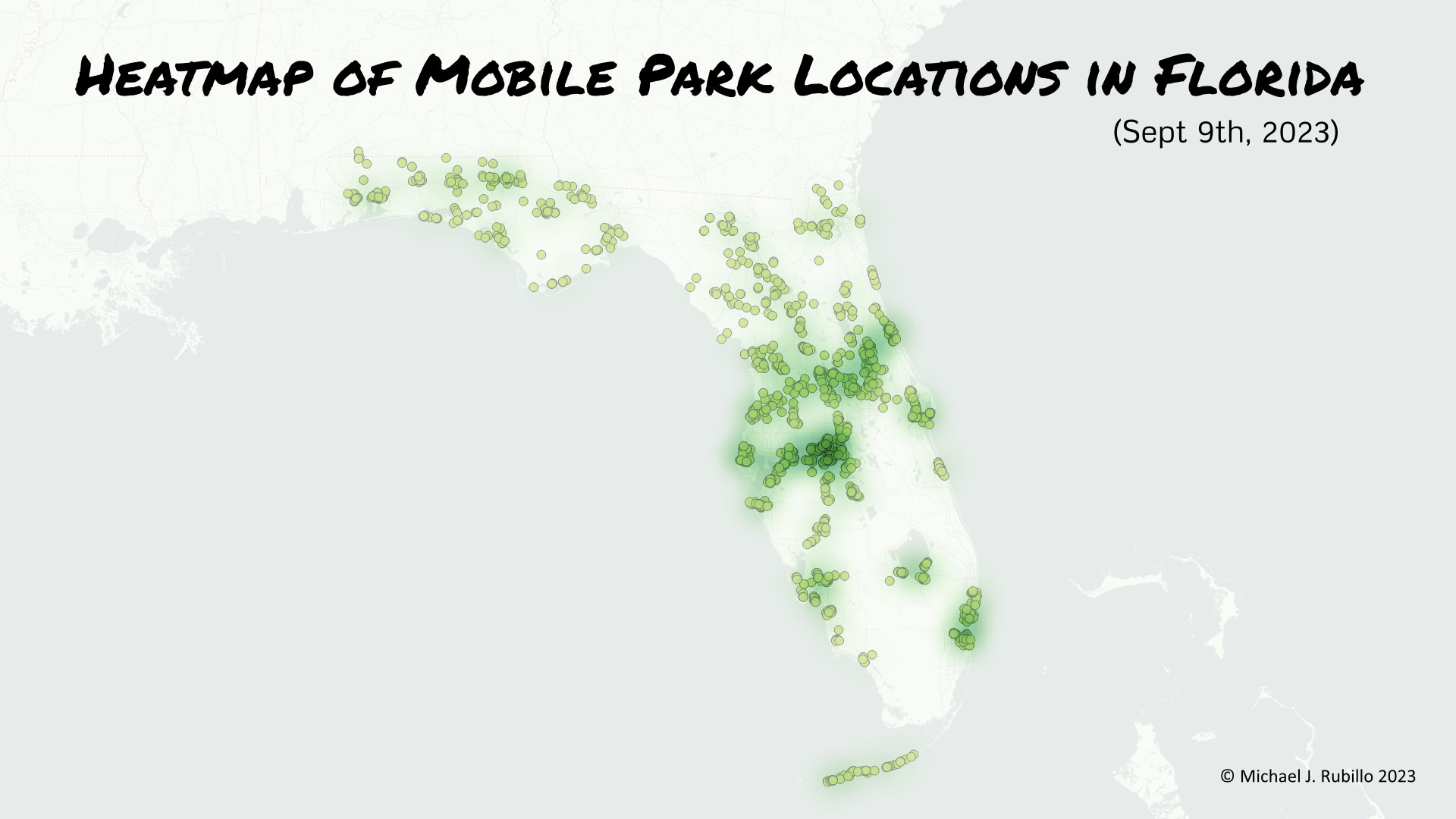
Static Heatmap:
I also generated a static heatmap displaying the geographical distribution of mobile home parks across Florida. Each park is represented by a point on the map, allowing viewers to gain insights into their spatial distribution.
Static Gradient Map:
For a broader perspective, I developed a static gradient map that visually represents the number of mobile home parks in each county. Darker shades of blue indicate a higher concentration of mobile home parks, helping us identify counties with a significant presence in the industry.

Bar Chart:
To complement the visualizations, I created a bar chart that depicts the number of mobile home parks in each county, with the county names listed along the bottom. Vertical bars represent the count, making it easy to compare and contrast the mobile home park presence in different counties.

Inventory Maps:
In addition to the distribution of mobile home parks, I also analyzed inventory data. I created two maps, one for sales inventory and the other for rental inventory by county. In these maps, the darker the green, the higher the inventory in that specific county. This visualization helps potential buyers and renters identify areas with a larger selection of mobile homes.


Combined Bar Chart:
For a holistic view, I designed a bar chart that combines both sales and rental inventory data on a single chart. Sales inventory is represented in green, while rental inventory is shown in blue. This visualization provides a quick overview of the market's offerings and highlights the differences between sales and rental availability in each county.

Conclusion
In this data-driven exploration of the mobile home park industry in Florida, we've uncovered valuable insights about the distribution of parks, their inventory, and geographical patterns. The interactive Google Earth model and various static visualizations provide a comprehensive overview, allowing potential investors, renters, and industry enthusiasts to make informed decisions.
Understanding the nuances of the mobile home park industry in Florida is essential for individuals interested in this sector. Whether you're considering investing in a mobile home park or looking for a rental property, these visualizations and data insights can be invaluable in guiding your choices.
Stay tuned for future updates as we continue to delve deeper into the fascinating world of data analysis, uncovering trends and providing insights to help you make informed decisions in the ever-evolving real estate landscape of Florida's mobile home park industry.